Project Client Category Year

Kantec Identity

Kantec Identity, Website 2016

Kantec are a construction company with years of experience working with architects on bespoke residential projects in London. They wanted to offer their range of services to a wider audience of clients. Our central idea for Kantec’s identity focused on highlighting their emphasis on process and journey of a build project from start to finish. The resulting ‘journey mark’ extends and contracts according to the situation it is being used in, whether it's a frame for text, a process timeline or a pictogram of a house.

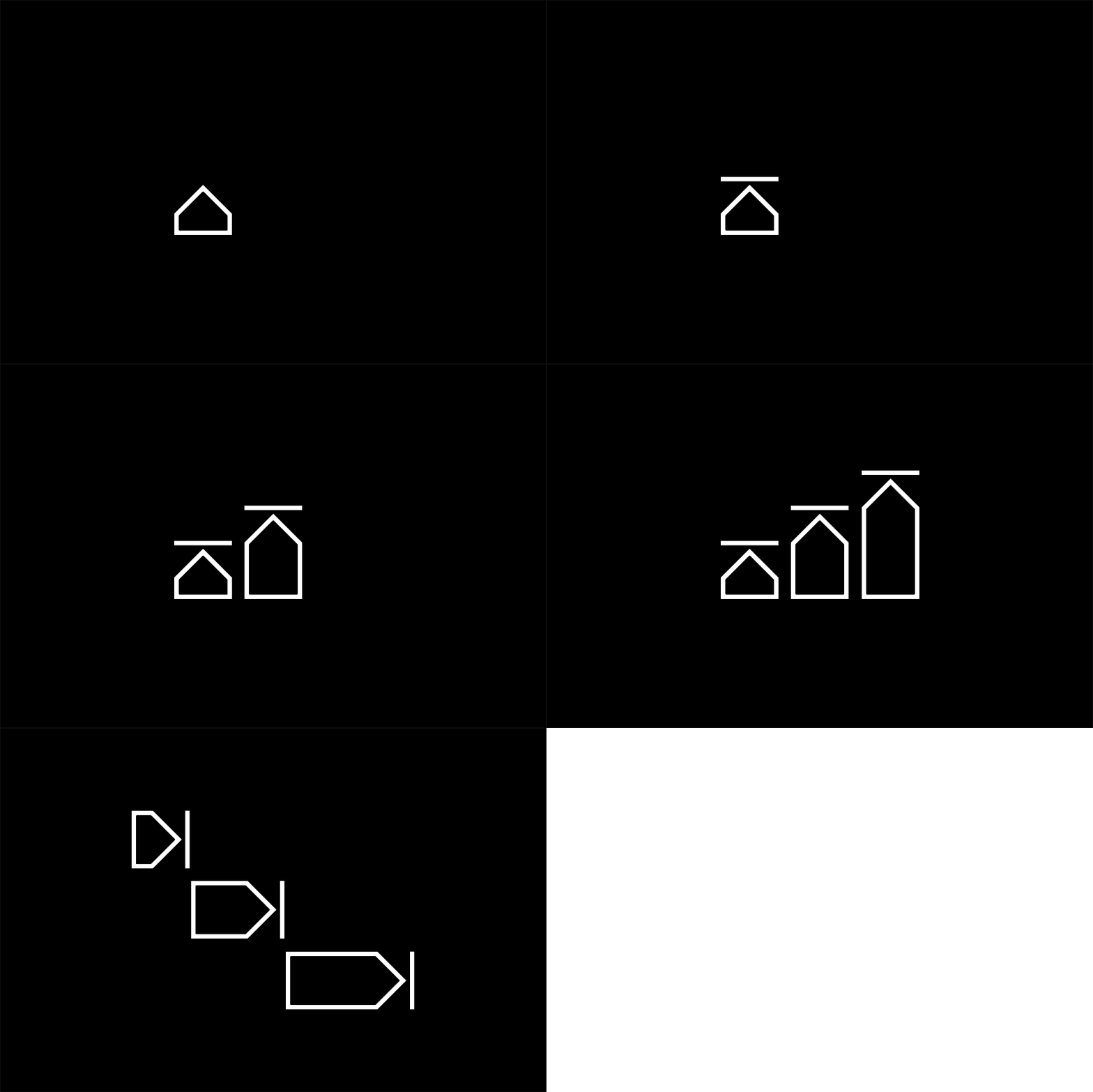
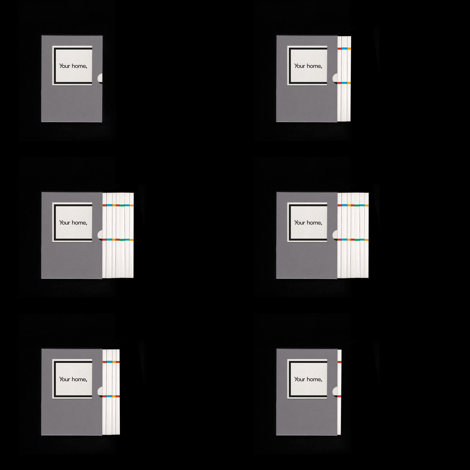
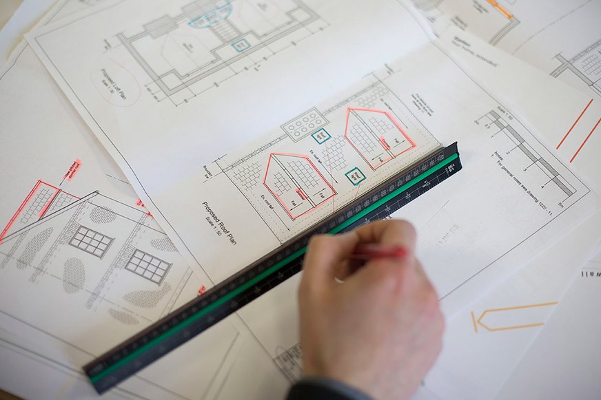
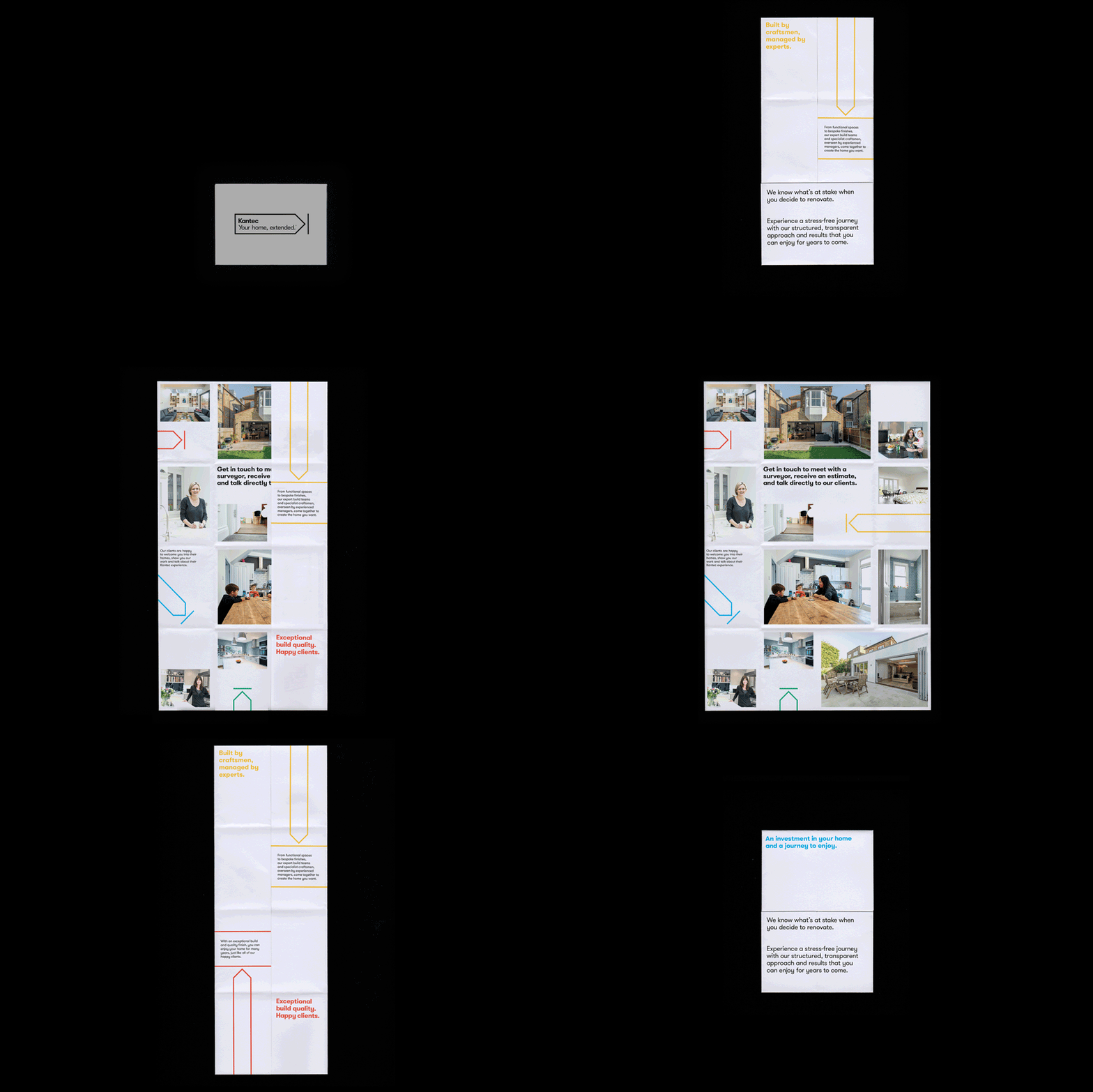
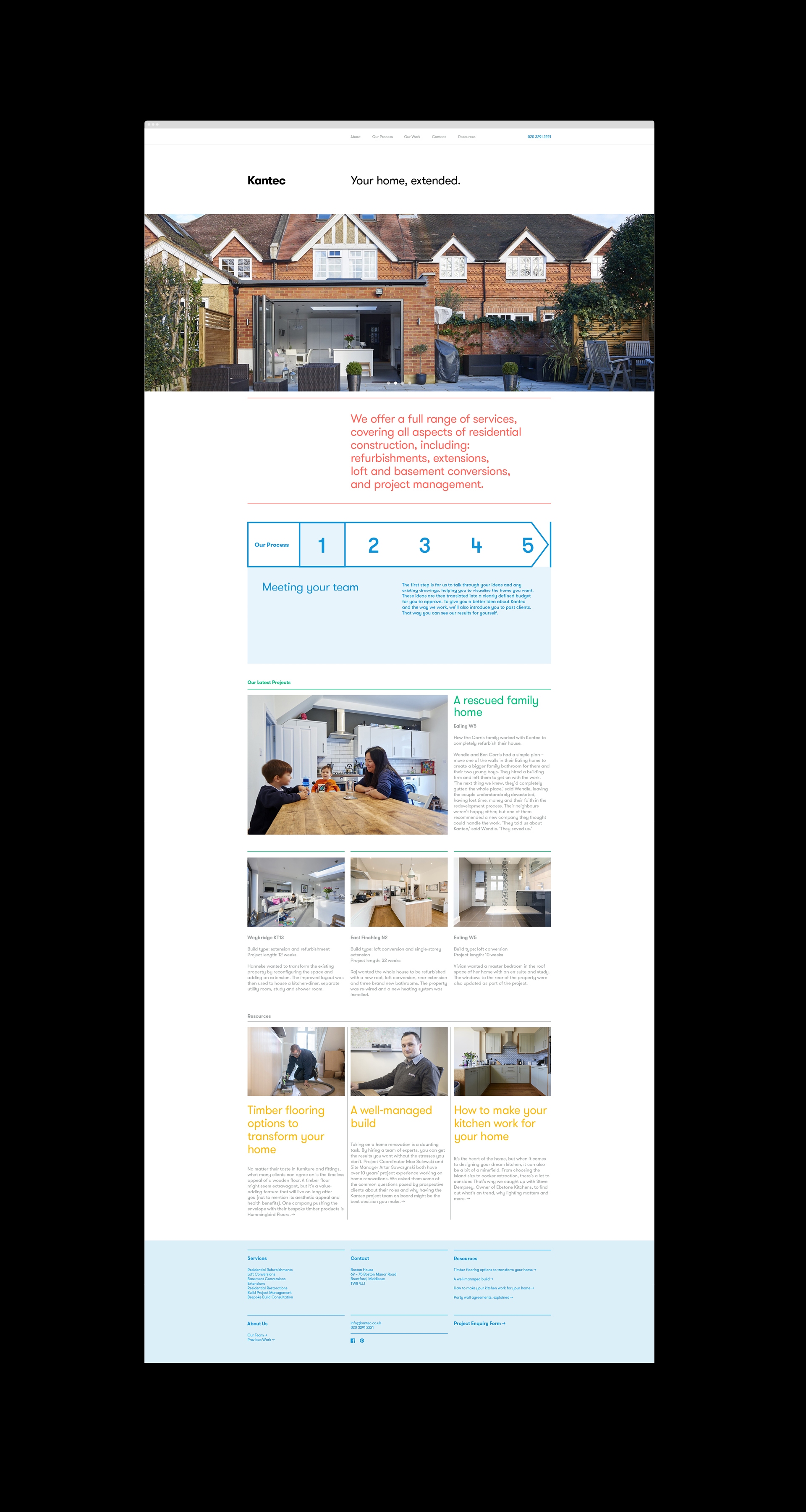
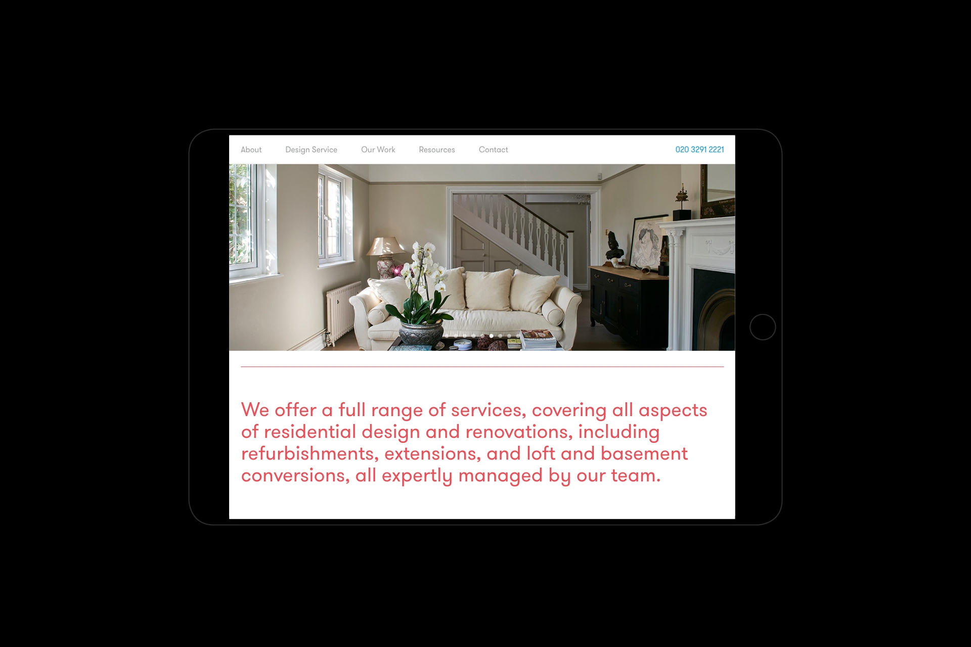
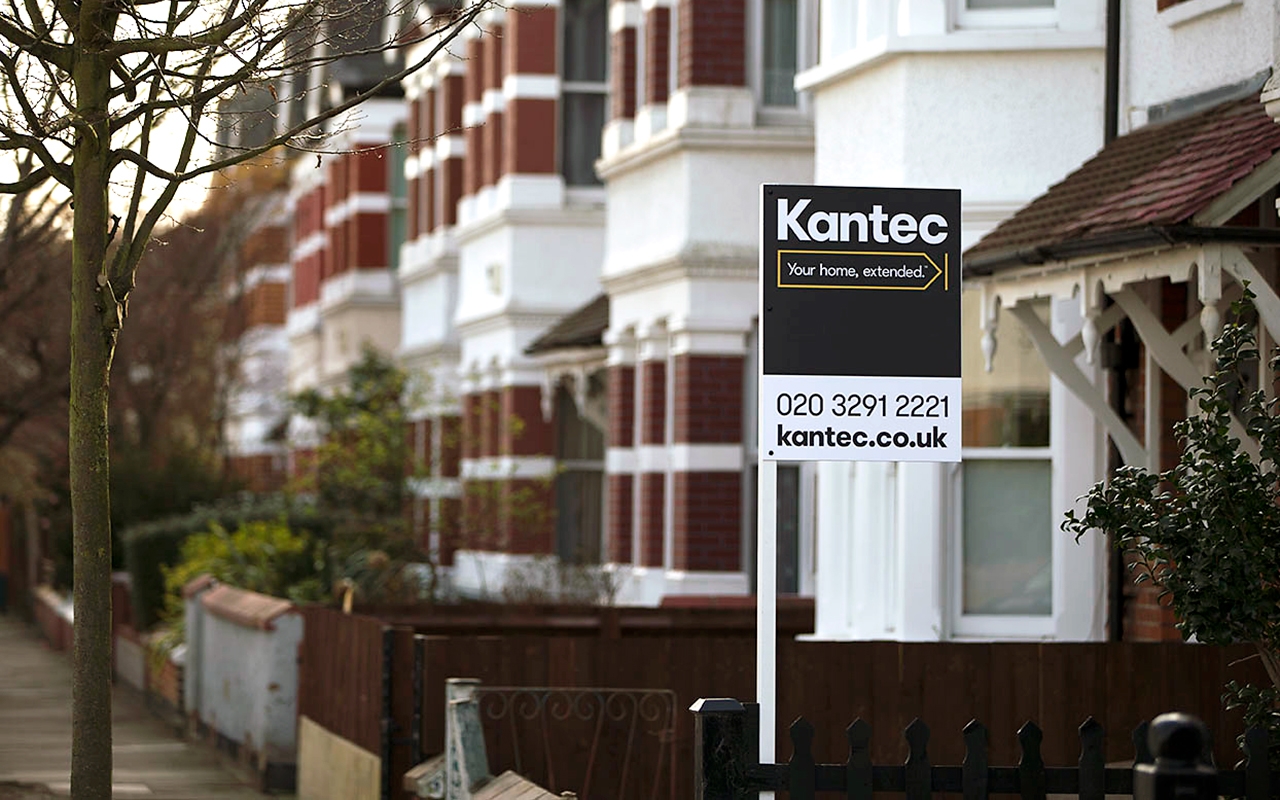
Logo animation for the Kantec rebrand Animation showing development of the journey mark designed for the new Kantec graphic identity. Logo options from the Kantec graphic identity. Detail image of a house renovation in London. Kantec business cards printed on Nomad Grey Smooth paper stock. Front and reverse of the Kantec stationery. Letterhead printed by Liqourice Press. Kantec building team at work on site in London. Portfolio of previous work in postcard form with bounding case. Animation of the house design postcards. Kantec new branded uniforms. Printed direct mail cards on GF Smith Colorplan. Shot of building plans at the Kantec office. Direct marketing fold out leaflet for new Kantec clients. View of a house extension by Kantec in London. Kantec website homepage layout. Website versions for tablet showing illustrations of different types of loft conversions. Website layout for Ipad. Board showing Kantec logo and contact details. Kantec decorator wearing branded safety vest. Kantec christmas card showing a christmas tree graphic made out of the logo mark elements. Kantec site builder at a house renovation in Richmond. New Kantec van branding.